Studio concept · Food packaging design
Fruit worth reaching for.
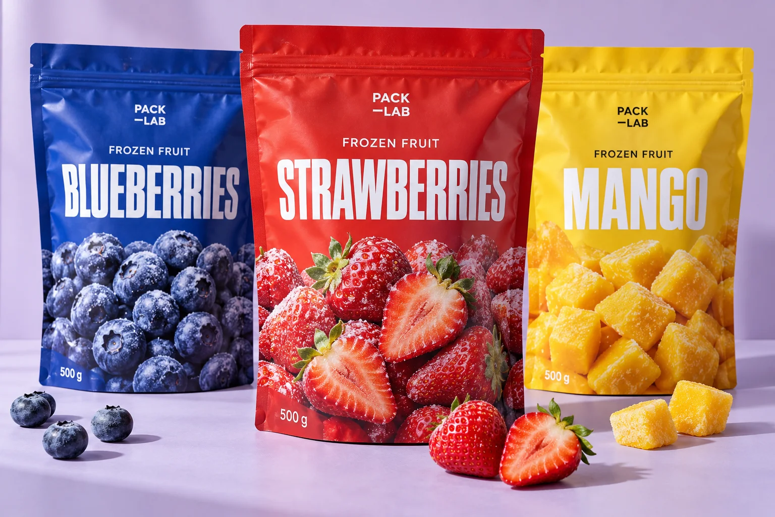
Bright fruit, bold type and a family made for the frozen aisle.
Design direction
Built around the product.
500 g resealable pouches
Challenge
Make different fruit varieties easy to distinguish while keeping a strong shared identity.
Approach
Rich red, cobalt and yellow pair with close-up fruit imagery. The resealable pouch gives the design room for a large product name and an uncomplicated front panel.
Deliverables
The concept
A coordinated design direction showing how the range could look. Final artwork is developed for the agreed pack sizes, approved product information and supplier dielines.
Original studio concept. Brand names, imagery and product data are illustrative.
Services used
Next step
Request a similar project
Send us your product information. We'll review what's needed and reply with a clear next step.
Request a similar project